PROJECTS +
Projects
MAN GRABS WEBSITE
DESCRIPTION
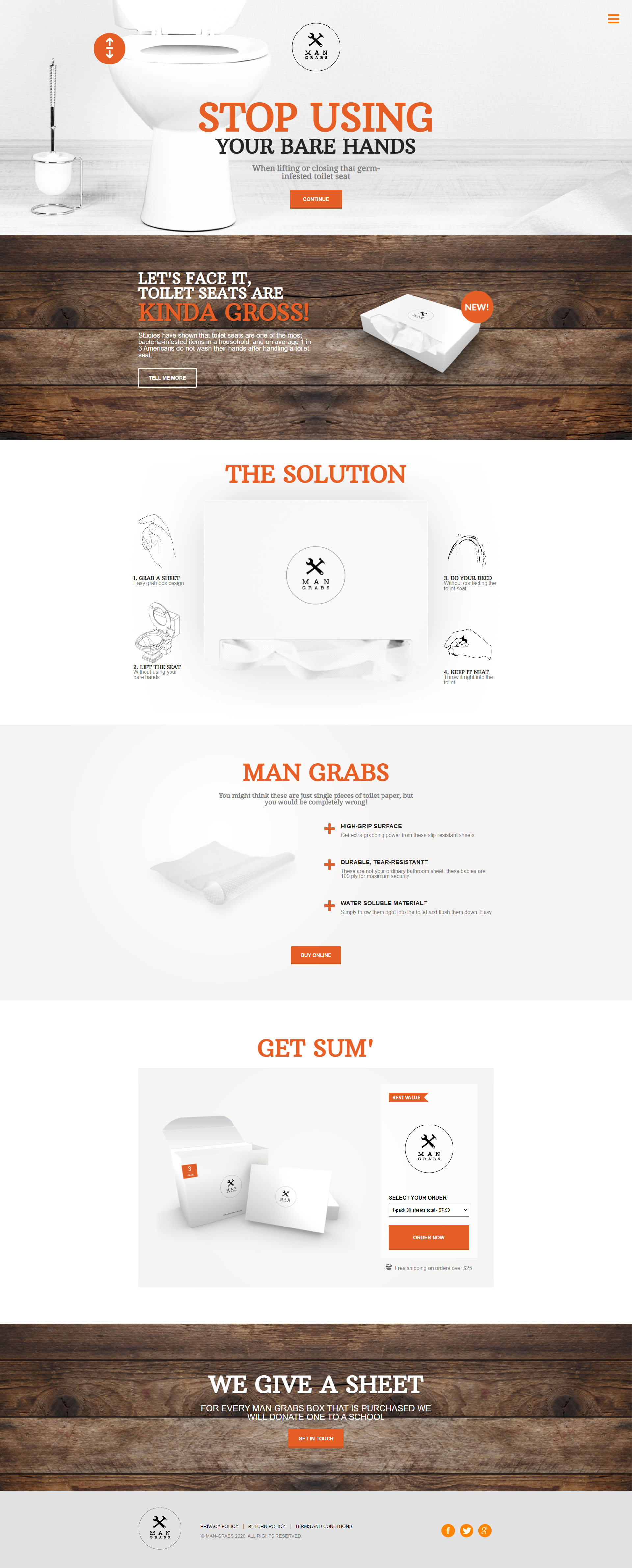
Man Grabs sells a unique product and we were tasked with visually showcasing this on the website
ABOUT CASE
Man grabs approached me to create a logo and website targetted towards men 25-60+ who can appreciate good hygiene. I wanted there to be a lot of white space, look really clean, but also really manly and bold. I think the colors and imagery really helped achieve that, but I especially liked working on the content myself.
CASE LAUNCH
November 24, 2018 – Web design & HTML/CSS

